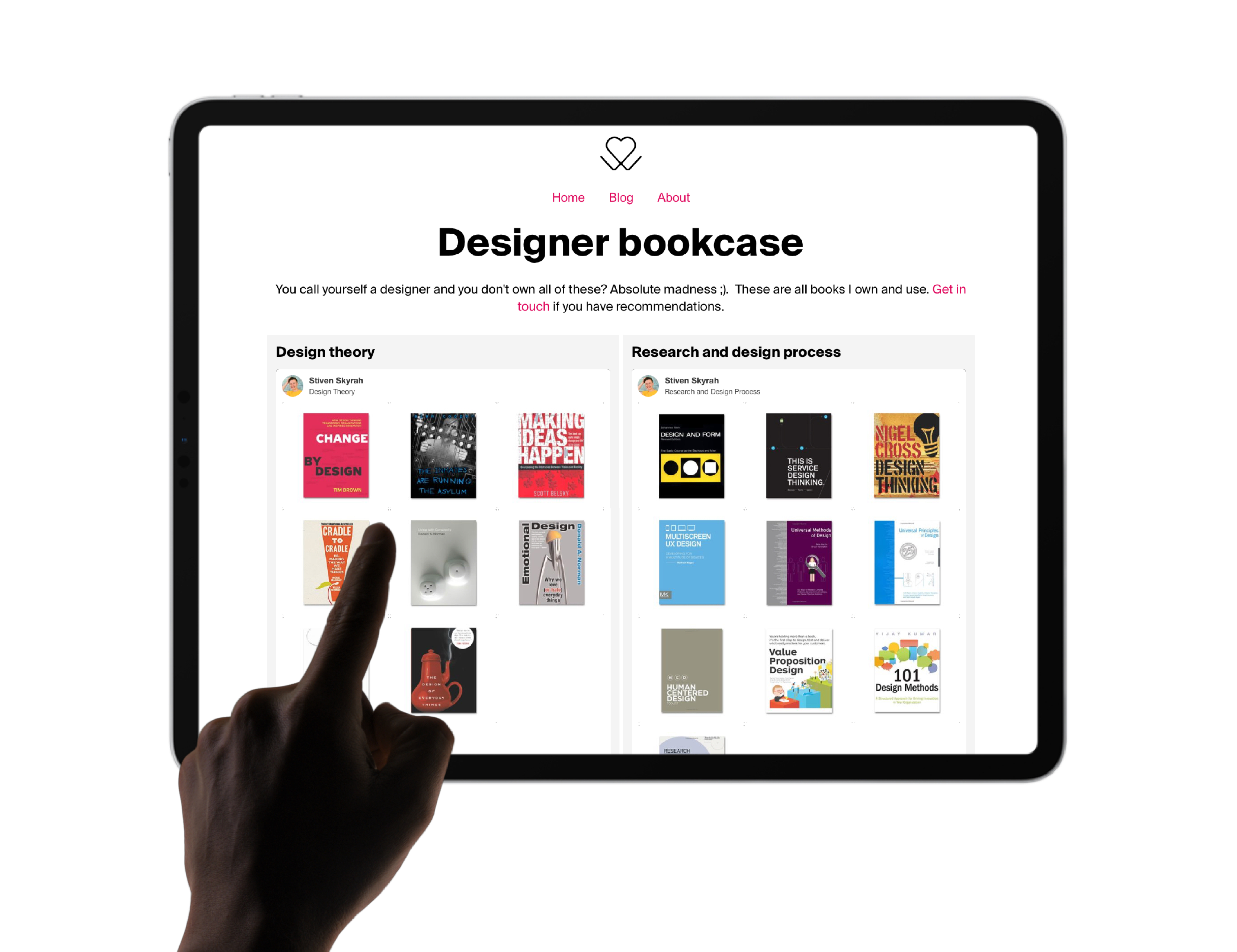
Today I've created a designer bookcase which includes multiple collections of all the design books I own. For scalability (and longevity) I used Pinterest as my organisational tool of choice. It means you and anyone else can easily subscribe to boards of interest and get notified of updates.
Design books are a passion of mine and I spend many hours pouring over their pages, I've been selecting and collecting them for years and many I acquired during my degree at Loughborough. My latest purchase was "Design and Form: Basic Course at the Bauhaus" that I found in an Oxfam charity shop of all places! It gives a detailed run-through of the basic course of the Bauhaus and is a really interesting read (as something that has become the foundation model of modern design education).
Another favourite of mine and a real must-have is "Manufacturing Processes for Design Professionals" by Rob Thompson. If you're considering buying a design book today let this one be it! Honestly, it's informed so many of my design decisions it's unreal and I've seen it in studios from Bradford to Moscow!
There are one or two extra books I will add in future as I haven't included any of my automotive design books yet, please do take time to have a look have a look and if you know of any great design books that I have missed out then please get in touch or leave a comment on this post.
The page implementation and design
There were some challenges around how best to implement the page, as the Pinterest widget library only supports fixed widths and heights. I did take a look into methods for creating a responsive iframe using CSS and simply iFraming it in too. I also explored a rage of WordPress Pinterest plugins but they didn't play nice with my theme.
In the end, I've settled for a series of widgets in my grid. It means that there is some responsiveness to the page, but on mobile the fixed heights result in some wasted space. (If you have any idea of how to fix it or a better way then do let me know).
 (with love)
